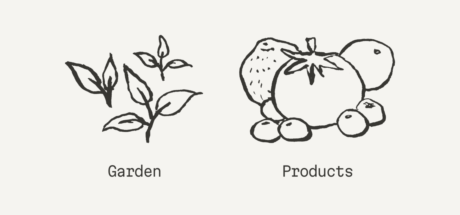
Over the past week or so I’ve redrawn some of the illustrations for the different spaces on my website. The pages on the website follow metaphors related to gardens and fruits. I imagine my website as a one-house town with a garden, a shop, a letterbox…
From the beginning I drew the illustrations to match the metaphors. I drew garden tools for the digital garden, a bag with things for offerings, wild flowers as gifts, a mail truck for the newsletter, and of course a blueberry (nabiu) character for the about page. Everything is tied together: the garden is where everything grows, it’s the most alive space, and from it come flowers (gifts) and a curated bag of vegetables and flowers (offerings), and a truck delivers mail (newsletter), to connect the house (website) to the outside world.
Then when I posted the first product, I added a page for products and used another version of the illustration I had done for offerings, but with the intention to draw a new one that would fit better: fruits.
I first redrew the products and garden illustrations. A bunch of fruits would now represent the products. And I wanted the garden to be better represented, so I drew some plants that start to grow.

Then, I realized some of the rest of the illustrations could also use a redo. So i drew new versions for the about, newsletter and entry/homepage. The illustrations for the about and entry pages are just redrawn versions of the same thing: a blueberry and a house. But for the newsletter, I thought that maybe a postbox would be better than a truck.

Another update I made to the website is I added a new page to contain all the tags in the garden, so it can be explored by topics, especially the more it grows. For this page, I drew some garden tags, like the ones some gardeners use to indicate which plants are which.

If you're interested to know more about this website and its design, you can read a bit about it in one of the first posts I wrote: My website's evolution: from channel to cozy home

Share this post
